This post should display a featured image, if the theme supports it.
Non-square images can provide some unique styling issues.
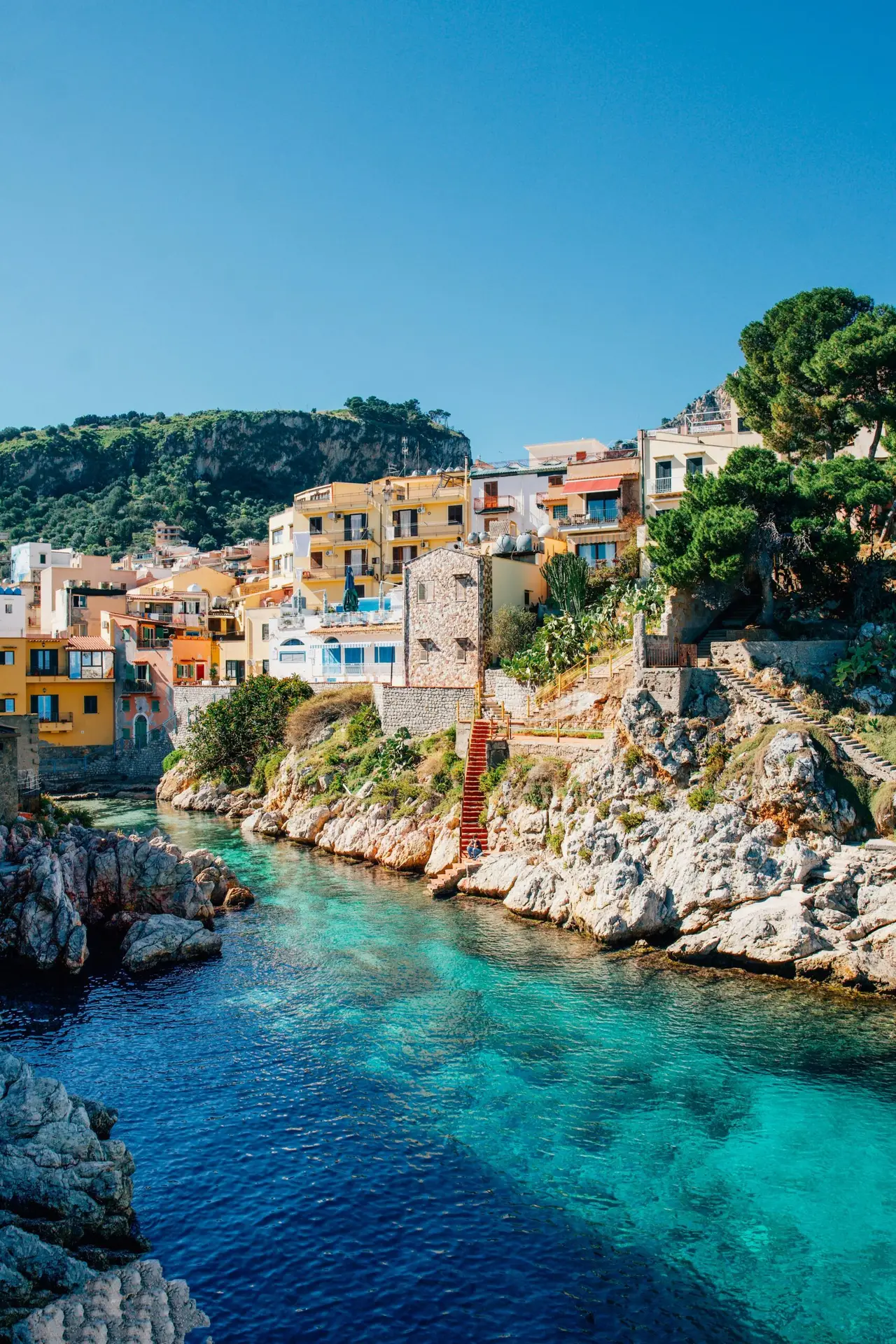
This post tests a horizontal featured image.
The Phoenix is a mythical bird renowned for its vibrant, flame-colored plumage of red, gold, orange, and purple, often described as resembling an eagle with a peacock-like crest and tail. Its appearance varies across sources, with some accounts depicting it as eagle-sized while others describe
Welcome to image alignment! If you recognize this post, it is because these are blocks that have been converted from the classic Markup: Image Alignment post. The best way to demonstrate the ebb and flow of the various image positioning option
Button blocks are not semantically buttons, but links inside a styled div.
If you do not add a link, a link tag without an anchor will be used.
Left aligned
Check to make sure that the text wraps correctly when the button has more than one line of text, and when it is extra long.
The cover block lets you add text on top of images or videos.
This blocktype has several alignment options, and you can also align or center the text inside the block.
Gallery blocks have two settings: the number of columns, and whether or not images should be cropped. The default number of columns is three, and the maximum number of columns is eight.
Below is a three column gallery at full width, with cropped images.
To change the number of columns, select the column block to open the settings panel. You can show up to 6 columns. If the theme has support for wide align, you can also set the alignments to wide and full width.